AI Employees
Manage your virtual employees
Chats
Dialog management center
Billing
Billing history and balance
Account Settings
Your account parameters
Video walkthrough
A short video tour of the Analytics and Profiles sections on the dashboard.
Context: personal account vs organization
The dashboard shows a different set of data depending on the context you are in — a personal account or one of your organizations. The context is switched in the top menu (or via the organization selector in the sidebar).| Context | What the dashboard shows |
|---|---|
| Personal account | Employees, chats, and expenses tied to you personally |
| Organization | Aggregated data across all organization employees, the organization’s overall balance, team KPIs |
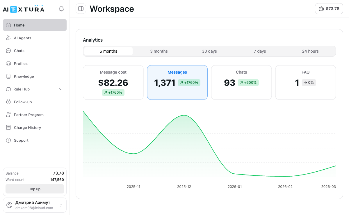
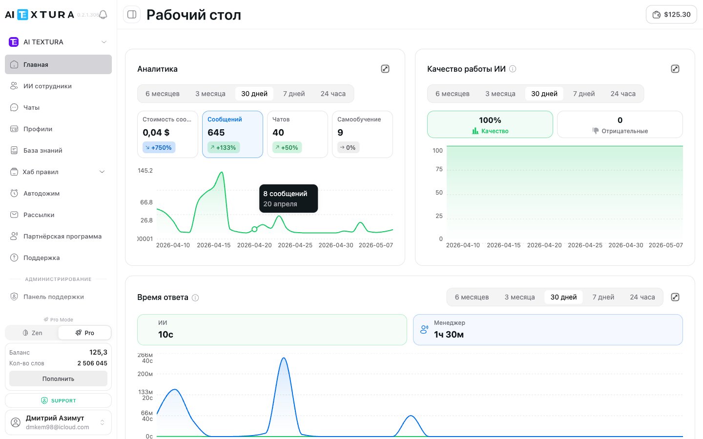
Analytics widget
The page’s main widget. The period switcher is on top, followed by metric cards and a line chart.Period switcher
| Period | What it shows |
|---|---|
| 6 months | Half-year summary (selected by default) |
| 3 months | Quarterly trends |
| 30 days | Monthly overview |
| 7 days | Weekly activity |
| 24 hours | Data for the last day |
Metric cards
Below the period switcher there are four clickable cards:| Metric | What it shows |
|---|---|
| Message cost | Total message cost in dollars for the selected period |
| Messages | Total number of messages processed by all employees |
| Chats | Number of unique dialogs |
| Self-Learning | Number of questions that landed in the FAQ / self-learning section |
Line chart
Below the cards is a line chart visualizing the selected metric over time. The horizontal axis shows dates, the vertical axis shows values. The chart automatically adapts to the selected period and metric.”AI Quality” widget
A separate widget that scores how well employees handle responses:- Quality % — overall quality indicator for the selected period.
- Negative — number of responses clients or managers marked as poor (including via thumbs down).
- Chart — quality dynamics over time.
”Response Time” widget
The widget was added in v2.5.0 — one of the headline monitoring additions of 2026.
| Line | What it shows |
|---|---|
| AI | Average response time of the AI employee. Usually seconds (e.g., “9 s”) |
| Manager | Average response time of a human manager when they join the chat. Usually minutes or hours (e.g., “1 h 30 m”) |
”AI Efficiency” widget
An analytical widget with two display modes — Table and Chart — and three breakdowns:| Breakdown | What it shows |
|---|---|
| By employee | Effectiveness of each AI employee separately |
| By channel | Which channels (Telegram, Wazzup, Bitrix24, etc.) generate more load |
| By dialog | Distribution across specific chats |
- Employee
- Dialogs
- Messages
- AI without manager — dialogs where the AI handled it alone
- Manager only — dialogs where only a human replied
- AI + manager — mixed dialogs
”Spending and billing analytics” card
A separate card linking to the Billing History section — there you’ll see the detailed billing history per employee and channel, the organization balance, and top-ups.Balance and words
In the top-right corner of the screen (and in the sidebar), you can always see:- Balance — current account balance in dollars
- Word count — remaining word limit
- Top Up button — for quickly adding funds
How to use the dashboard
Check the context
Make sure you are in the right context — personal account or a specific organization. The switcher is in the sidebar.
Select a time period
In the “Analytics” widget, click the desired tab: 24 hours, 7 days, 30 days, 3 months, or 6 months.
Review the metric cards
Look at the four cards: message cost, number of messages, chats, and self-learning. Pay attention to the percentage change.
Click a metric of interest
Click a card to update the line chart and display the trend for the selected indicator.
Cross-check with quality and response time
Scroll down and check the “AI Quality” and “Response Time” widgets. If you see anomalies — go to Chats to review specific dialogs.
Review efficiency
In the “AI Efficiency” widget, switch the breakdown (By employee / By channel / By dialog) to see where automation works best.
FAQ
Is the dashboard data updated in real time?
Is the dashboard data updated in real time?
Yes, every time you visit the page you see the most current data.
Can I view analytics for a specific employee?
Can I view analytics for a specific employee?
The “Analytics” summary widget shows data across all employees. For detailed statistics on a specific employee, use the “AI Efficiency” widget (the “By employee” breakdown) or the Billing History section.
What does the percentage next to a metric mean?
What does the percentage next to a metric mean?
It represents the change compared to the previous equivalent period. If “30 days” is selected, the comparison is with the preceding 30 days.
Why is manager response time measured in hours and AI in seconds?
Why is manager response time measured in hours and AI in seconds?
This is normal and expected. The AI employee replies instantly, while a manager joins when they see a notification or open the chat. The “Response Time” widget exists precisely to show this gap and help you decide which scenarios to hand to the AI.
"Response Time" widget is empty — why?
"Response Time" widget is empty — why?
The widget appeared in v2.5.0. If you’re just starting out or have no dialogs with manager replies in the selected period, the charts will have little data. Expand the period to 30 days or more.
I'm in my personal account, but the analytics is empty. Where did it go?
I'm in my personal account, but the analytics is empty. Where did it go?
Most likely, your employees run in the organization context. Switch to the relevant organization in the sidebar — the data will appear.